

Nike
role & responsibilities:
art direction, user research, design research, copywriting, interaction, visual design, ui design, and graphic design
brief:
this project was self-generated.
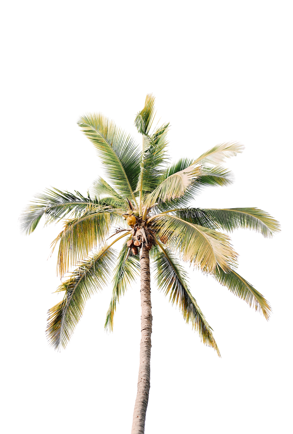
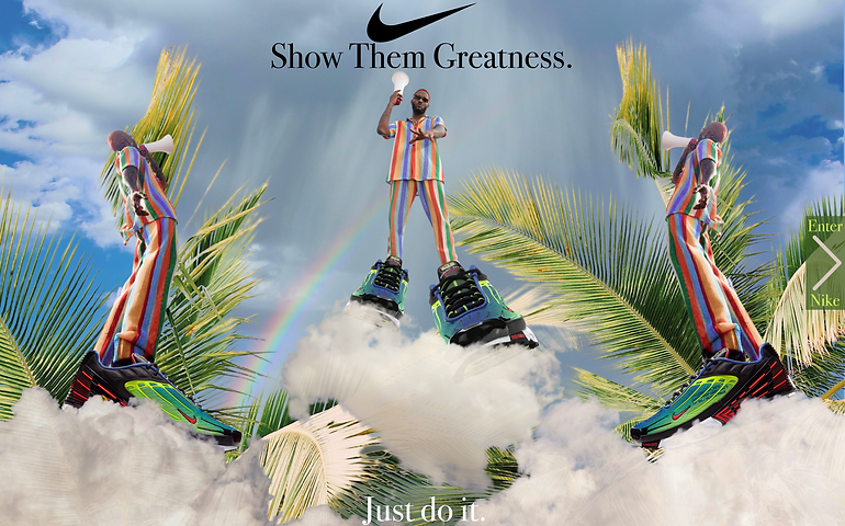
nike is launching a collaboration with nigerian artist prettyboy d-o using the nike air max plus 3 parachute green sneakers.
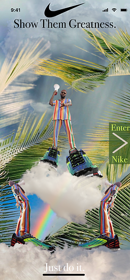
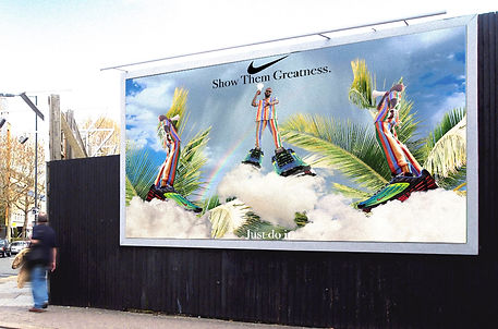
your task is to design an advertisement image incorporating the sneakers and showcasing prettyboy d-o's fun, whimsical and eccentric personality, and also capturing the essence of the nike brand. the advertisement image which will also be used as a landing page will be the first thing customers see when they go on www.nike.com. it should clearly show navigation to the main nike page.
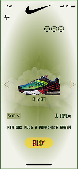
you are also to design a product page for the sneaker.
these designs are for computers and mobile phones.
the designs should appeal to the modern-day lagos/nigerian market and also the nike customer.

advertisement design for landing page and product page design


business problem:
this collaboration is an opportunity for nike to test out an advertisement in the nigerian market in the hopes of potentially setting up a long-term base in the country, so appeal to the contemporary nigerian is essential.
design research:
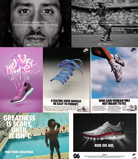
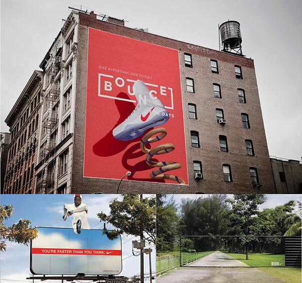
for me, the challenge with this project was going to be striking the right balance between the nike brand and prettyboy d-o's personality and style. with that in mind, i began by identifying themes and patterns in nikes branding through advertisements. commonalities in the ads i gravitated towards included: powerful or inspirational messaging, whimsical photography/imagery, and images using natural elements in the design composition.
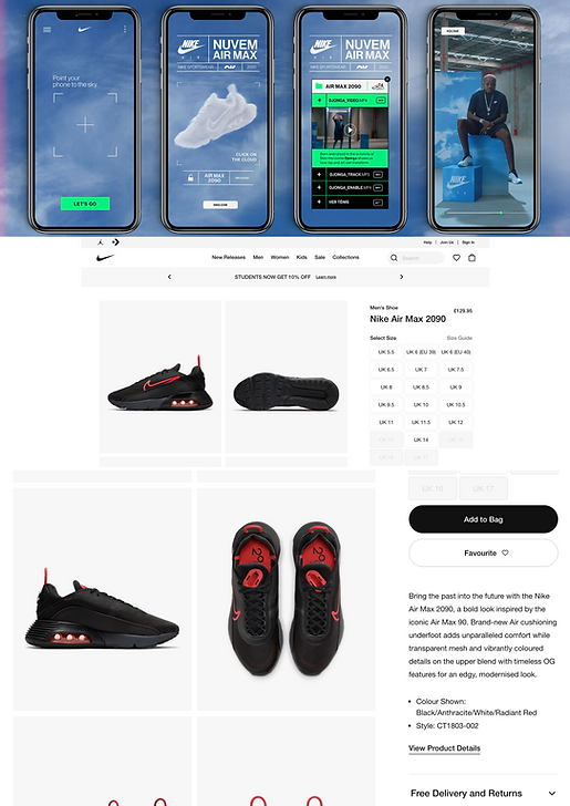
product page on nike site:
beyond advertisement, i studied the nike.com product page to understand why it works and how i can bring something bespoke/new to the brand for this collaboration but still stay true to its dna. some elements i identified from the nike product page that will also be in my design include; a clean and uncluttered layout, navigation in familiar locations but out of the way when not in use allowing the eye to be instantly drawn to the product, call to action using a target colour, hi-res photos of the product and multiple images for a deeper context of the product.
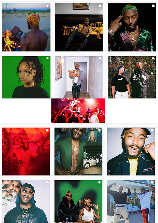
analyzing prettyboy d-o:
to get an understanding of prettyboy d-o's personality and style i looked through images of his related to his music & branding, read interviews he's done, and watched his live performances. the adjectives i came to associate with him are energetic, bold, colourful, striking, and resilient. his journey to musical success was a slow one driven by self-belief and an ever-present chase for greatness. he is passionate about his country people and country (nigeria) and desires greatness for both.

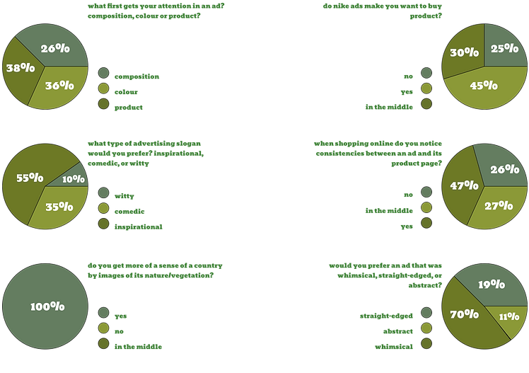
user research:
with the challenge of two branding identities coming together i decided to get insight from both audiences (15 people in total) to further influence my final designs. i asked closed-ended questions to get the most accurate impressions.
.png)

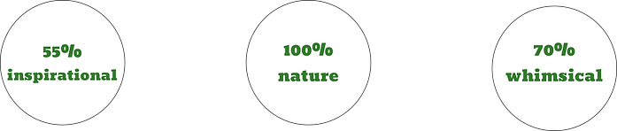
insights:
from the responses i collected, i decided to create a whimsical ad with an inspirational slogan incorporating images of nature from nigeria.
slogan ideas:
the slogan i selected is inspired by the nigerian slang "sho dem". it is commonly used as a motivational phrase to hype someone up and make them feel confident. i feel it honours the nike brand and gives a nice nod to the country and nigerians.


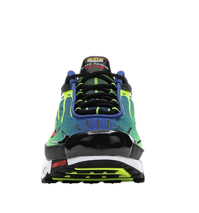
nike air max plus 3 parachute green:


type:
i used "bodoni 72 oldstyle" which is a font nike has used often in their ads, and "digital numbers" because i felt in the context of the design composition it reminded me of tree branches.
.png)


retrospective:
looking back on this project i learnt a helpful lot about persuasive product pages. nike has exceptional user experience and it was a great education deconstructing the nike.com product page. i would have liked to dissect the sneaker more but i didn't find any real need to do this that would benefit the project. next time this is something i would love to do.