

Josh Ivory Fitness
website design for fitness recipes
role & responsibilities:
art direction, market research, design research, copywriting, visual design and ui design
brief:
this project was self-generated.
josh ivory is a pt looking to launch a site of fitness recipes targeted at young men and women who go to the gym and want to put on weight or muscle mass. it should incorporate some millennial slang and also be classic and fun. it should be easy to navigate and not have too many pages to click through.
you are to design a home page, one product page showing the food, and a contact page.
business problem:
josh ivory is also looking at advertisements in the long run for his marketing and promotion so the image created for the food page should easily be transmittable to an outside advertisement, e.g. on a billboard or bus stop. the image should be attention-grabbing and fun.
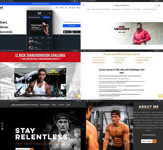
market research:
to get insight into the current visual landscape for young fitness business owners i decided to do some market research looking at their sites and their visual elements. the common theme i noticed was that they were often black or white, the sites seemed cold to me and didn't draw you in. while i liked the close-up photography showing the owner's physique, the general design was a bit dull to me. this impacted my decision to really go for it with the colors, images, and font for josh's site. i wanted to create a design that was very bright and lively.
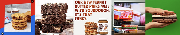
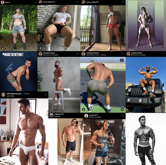
mood board:
the mood i wanted to create for the site design revolved around the words "clean, big, bold, colourful, fun, and sexy". i was drawn to big texts, food layered on top of each other and shot close up, primary colours, use of cartoonish elements, and sexy imagery showing physique. as well as images of fitness/gym teams. i found these images conveyed a sense of support and togetherness in the fitness journey that i wanted to incorporate in my design.
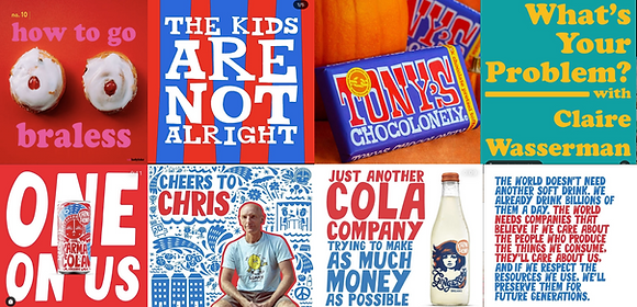
text inspiration
layered food inspiration

cartoonish elements and teams
sexy physique
typography:
based on the mood board i knew early on the main font i wanted to use was impact, because it's very legible, stands out, and is easy to read because of its thick letters.

user research:
to make my design choices more user friendly i asked close-ended questions that would help me create something that would benefit both user and client needs.

slogan ideas:
this was one of the most fun parts of the process, i tried to strike a balance between catchiness, cheekiness, and branding awareness.


sitemap:
i made a conscious effort to keep the navigation on the page as minimal as possible. because of the imagery, colour, and info, i didn't want the user to be overwhelmed with a lengthy click-through process.

lo-fi wireframes:

further typography:
other than the impact type for main text i chose alfa slab one to be a supporting type to impact, and amatic sc cause of its youthful look.


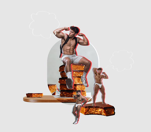
highlight around images:
from my mood board, i was very inspired by images of people and text that had been outlined, i wanted to expand on this inspiration and my inspiration of the "teams" by creating background layers of josh's' physique that i could manipulate for colour highlights. i felt this would add some depth and more colour to the overall layout without being too overwhelming.


retrospective:
i learned helpful info about advertising images and image creation in this project, and this is something i want to develop further in the future. looking back i personally think i could have been bolder with the general layout in terms of colour. maybe thats me being hard on myself, but i think it could always be better.